How effective is the combination of your main product and
ancillary texts?
There are certain motifs that stand out in all of my
products for example within the music video I kept to the colour scheme of
black red and white this was to really try and get across three different
emotional versions of my singer so that it could appeal to three different
types of audience members, as I was always trying to sell her in the way of
voyeurism to my audience therefore I thought I should go down the same route
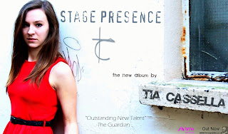
when it came to my ancillary task. This meant that when it came to my poster I
knew there was at one point during the filming a perfect shot which showed my
singer looking very seductive but slightly vulnerable and innocent, also the
way she was framed was perfect for putting the rest of the information needed
to go on my poster therefore I felt that the poster was really selling just as
much as what the video had to offer. There is one difference though that when
it came to my digipack I really wanted to remind people that my genre was
electro pop but at the same time I wanted to give the feel that my performer
was a really good live performer as well so to incorporate that into the
selling of my singer I thought I should aptly name the album, Stage Presence, which
fitted with how she looks on camera and acts yet at the same time insinuates
she loves the stage including live arena’s therefore making the link with live
performances. I don’t think I showed this much in my video or hinted it in my
poster however the main construction of my digipack did really revolve around
that idea hence the cover underneath the cd was made of the jack leads put
together to again emphasise the feeling that she is a performer and is just as
good on tour, yet sticking to the typical conventions of electro pop by showing
the speaker and the microphone in the case as well.
However in the midst of creating the digipack and the poster
at the same time I really wanted to have something that linked them because I
had already shown my lead singer in the poster so I thought it would be best to
challenge the conventions of my genre electro pop and not have my singer all
over the cover of my digipack as I think it entices listeners and viewers to
want to look her up and watch her whether it would be her live videos or her
performance ones either way it was all about enticing the audience in. So to
link my two ancillary tasks together I came up with the idea of having a brand
logo (The TC that you see in both of them) so that this way you could always
identify the brand of Tia casella and link it to anything without having to see
my performers face over everything and I think that subtlety works when coming
to sell an album to an audience.
The links between my digipack and main product aren’t as strong
as the poster however I have tried to incorporate aspects from the music video
into the digipack, things such as sticking to the colour scheme to give you
three different aspects of my digipack, which would be the live performance,
video performance and the tour performance, along with the microphone panel
with the red electrical energy flowing from her to show how new and exciting
her character is, jut like the feel when you are chucked straight in with the
music videos choppy start so it captures your attention and alerts you to
something quick and enticing.


No comments:
Post a Comment